
SANTANDER BANK
SANTANDER BANK


IMPROVING THE IDENTITY VERIFICATION PROCESS
Web and Mobile Native App (iOS & Android).
Overview
client
Santander Bank US
My role
Lead UX Designer (end-to-end)
timeline
December 2021-April 2022
Stakeholder goals
(1) Improve customer satisfaction metrics and verify customers fast yet securely
(2) Decrease verification-related complaints
Customer goals
(1) Access online banking fully with a domestic or international phone number
(2) Bypass verification with low friction and strong account security
Background
Today, Santander Bank customers must confirm their identity through SMS text verification to access their full online banking features. Customers report difficulty bypassing this verification step, consequently inhibiting them from self-servicing online.
Highlights
(1) Introduced new UI components and screens to design system
(2) Expanded verification methods to support international phone numbers and customers without SMS capability
(3) On track to increase login NPS and customer satisfaction KPI

Opportunity
How might we unstuck these customers at the ID verification step so that they can self-service in their online banking with ease and security from fraud?
problem
Customers get stuck at the One-Time Passcode (OTP) verification step, restricting their access to complete online banking features.
In Q4 of 2021, this drove 25% of customer complaints.

User research and insights
First it was important to learn why customers get stuck at the verification step. So I conducted customer research and analyzed customer feedback from our internal portal, website session recordings, and heat maps.
I identified 3 recurring scenarios where customers get stuck:
If a customer registered a landline number during sign-up, they can't receive the default SMS verification meant for mobile phones.
If a customer registered a mobile number during sign-up but doesn't have access to their mobile phone at the time of verification (e.g. when traveling internationally), they also can't receive the default SMS verification.
If a customer is using an international phone number, they can’t receive the default SMS verification.


Above are examples of the customer complaints
Customers expressed frustration at having to resort to calls to the Customer Service Center or visiting a local branch for assistance, which contradicts the intended self-service online experience.
Data indicates that about 20% of customers have closed their Santander account due to the frequency of this issue.

Next, I collaborated with product owners to understand the issue deeper.
We discovered that 10% of our customers solely use landline numbers. This indicates that our current SMS-based verification method is not suitable for at least 10% of our customers.
We further assessed its effects on our business side and found low login NPS* and KPI scores*.
*To comply with my non-disclosure agreement, I have omitted specific scores in this case study.
Key insights

For customers…
This causes frustration and increased rate of customers leaving our bank for our competitors.

For the business…
This hinders our strategy to migrate customers to self-service online, and causes low KPI and NPS.

For both…
The current verification method doesn't work for more than 10% of our existing customers.
customer Pain Points

Having registered a landline number as the primary number during account sign-up instead of a mobile number.

Having registered a mobile number as the primary number during sign-up but don’t have immediate access to their mobile phones at time of verification.

Having registered an international number as primary number.

market research
I conducted market research to learn about industry best practices and how our competitors handle this. Then I presented my findings and design recommendations to product owners and stakeholders which shaped our solution.
My presentation focused on:
How is verification handled?
How are inputs formatted?
How is the information displayed?


Ideation & Team Alignment
Next, I met with the product owners and engineer leads to brainstorm solutions and agree on project goals and scope.
How might we solve for…
…Pain point A? (Having registered a landline number as the primary number during account sign-up instead of a mobile number)
Solution: Offer outbound voice OTP delivery, allowing customers to receive a passcode via a phone call.

…Pain point B? (Having registered a mobile number as the primary number during sign-up but don’t have immediate access to their mobile phones at time of verification)
Solution: Expand verification options to include email and Debit/ATM/Credit Card information.

…Pain point C? (Having registered an international number as primary number)
Solution: Expand OTP service to support international phone numbers.

Design goals

Design new screens and user flows for customers to select new verification methods
Design new screens and user flows for customers to input international phone numbers to their ‘Manage Profile’

Enhance design system with new UI components (ie. country code picker, new icons)

Modernize our UI components to stay competitive.

Design across web and mobile native apps (iOS and Android), responsive design.

Solution - iteration 1.1
Expansion of Verification methods

Current experience, iOS display

Proposed experience, iOS display
decision behind the icons + intended impact
I incorporated fresh icons sourced from the global design system as part of our ongoing initiative to transition and modernize our icons from their previous versions. This change would enable us to remain competitive and maintain a contemporary appeal to our customers.

decision behind the ui and flow + feedback
I presented a future-focused design that can adapt to include email and payment card verification when feasible.
The team acknowledged constraints with my proposed design because it would require more development time than our launch schedule allows. Therefore they suggested design revisions that leverage existing our design system. They also advised simplifying the selection process on a single screen.

Solution - iteration 1.2
International Phone Number input


iOS display, first iteration of the ‘add’ phone number flow
Designing the country code picker
I workshopped with the VP of the design team to brainstorm ideas. We prioritized being good design partners, so we explored open source libraries that we could relay to our Development partners to leverage.
We generated ideas by mix-and-matching features from various examples that offer great UX. We made sure to also leverage existing components from our design system, such as the text field input and icons, for efficiency purposes for our team.
We determined on the final design after conducting A/B tests between two variants and ultimately chose the design that allowed customers to input their country information faster to ensure conversion rate optimization.


Examples referenced

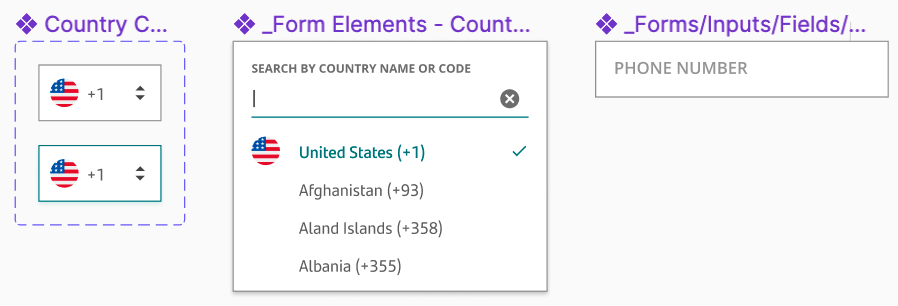
Components I created and added to the design system
TEXTFIELD FORMATTING FEEDBACK + iteration
We ran into an API issue.
Our Development partners alerted us that the API cannot return all international phone numbers with their corresponding formatting aside from US-based numbers at this time. Currently, our API can’t validate all international numbers to auto-populate number formatting.
Additionally due to time constraint, the Dev team is unable to pick up work for the placeholder at this time. It will be included in the next release of this design.


Proposed textfield design

Revised textfield design due to constraint
Solution - iteration 2.1
Expansion of Verification methods

Second iteration of the ‘add’ phone number flow - OTP screens
Scoped down solution
Per the team's recommendation, I leveraged design system radio buttons. I made this choice because my market research found that 5 out of 6 competitors follow this best practice. Radio buttons offer low cognitive load and fulfill accessibility requirements.
I also streamlined the content onto a single page, making the customer journey more efficient with one less screen to navigate.

Final Screens

the wireframes

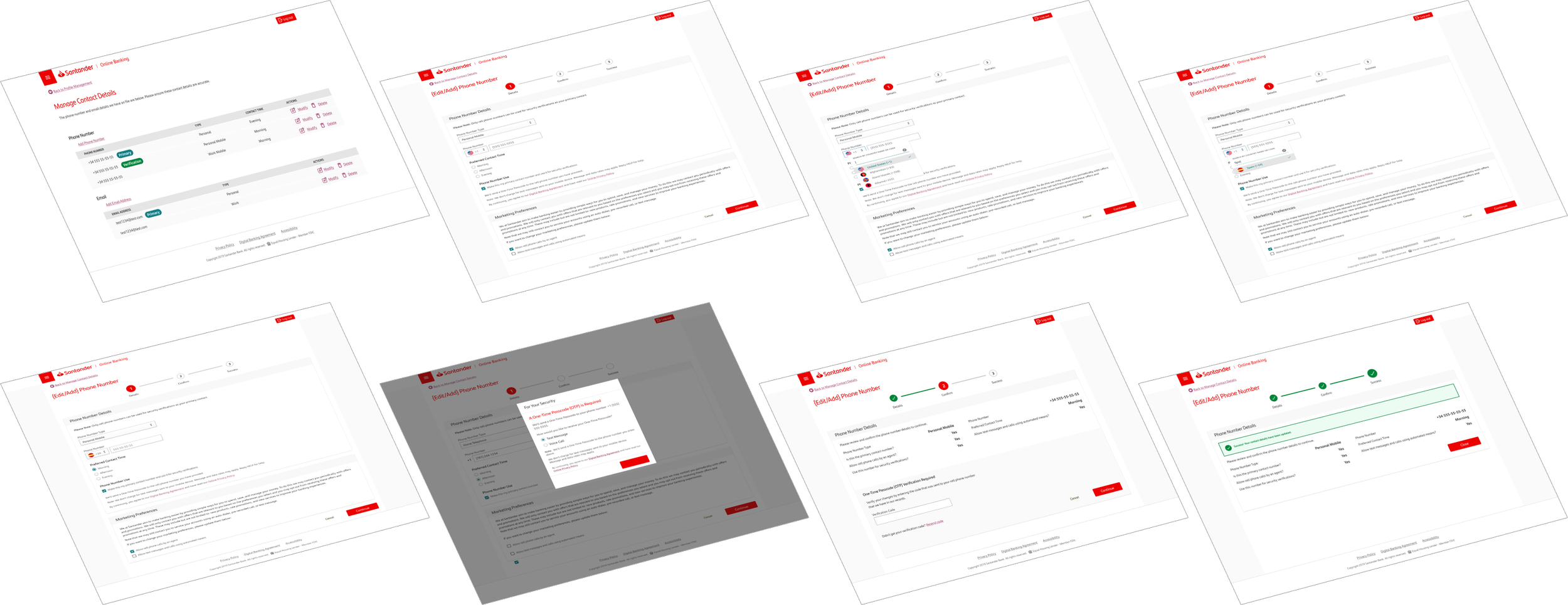
(Top screens) iOS display. Android looks similar but utilizes its built-in country code selector.
(Bottom screens) Web display.

next steps
Track metrics of success
To ensure that my solutions are effective, I asked our PMs for metrics 2 months post launch.
They report an 80% decrease in complaints about this issue from our internal customer portal since launch
53% decrease in Customer Service Center calls related to this issue
7% decrease in account closures
Overall increase in SMS received/open rates, login NPS, and overall customers satisfaction
Learn from data and continue to iterate
Continue iterating on designs after gathering data performance from PM
Advocate for long-term solutions for future-proof these designs
What I learned

How to compromise on design
I communicated early and often with the team to deliver within changing constraints.

Learned about API functionality
I learned to design around different API capabilities.

Designing across iOS and Android
iOS and Android experiences can be different - and that’s okay.